The landing page is what a visitor sees at the root of your Dewstack docs site – a hero with a title and a button, above a grid of your collections. It is optional: turn it off and / sends visitors straight to /docs, at the first published page.
Everything on this page lives in Customize, in the Landing Page and Header & Footer sections.
Turn the landing page on or off
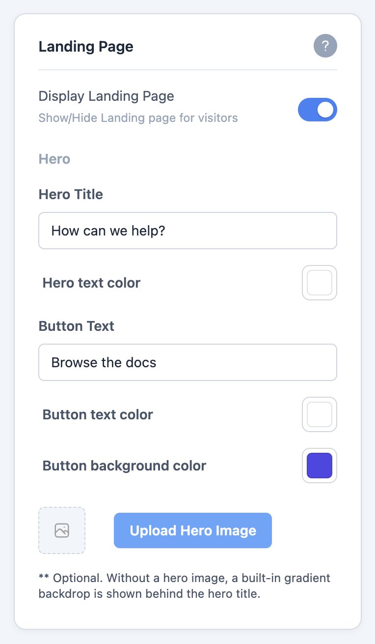
Customize → Landing Page opens with the Display Landing Page toggle, described as "Show/Hide Landing page for visitors".
Off, anyone visiting your site root is redirected to /docs. That is the right setting when your
docs are linked from an existing marketing site and a second front page would only add a click.
The header, footer and every article page are unaffected either way.
Configure the hero
The Hero group sets the band across the top of the landing page:
| Field | What it sets |
|---|---|
| Hero Title | The headline text |
| Hero text color | Colour of that headline |
| Button Text | Label on the call-to-action button |
| Button text color | Colour of the button label |
| Button background color | Fill colour of the button |
| Upload Hero Image | Background image behind the hero |
The hero image is optional. Without one, Dewstack draws a built-in gradient backdrop behind the hero title, so the landing page never looks unfinished while you are still hunting for artwork.
Header links and CTA buttons
Customize → Header & Footer configures the bar that appears on every page, not just the landing page.
- Header Title 1–5 and Header Link1–5 – up to five navigation links. Fill in the title and the URL it points at; leave a pair blank to omit that link.
- CTA 1–2 and CTA link 1–2 – up to two call-to-action buttons, styled more prominently than the plain links. These fields are hidden on Theme 3, which has no room for them in its header. See Themes and dark mode.
- Links color – colour of the header link text.
- Header Background color – fill behind the header.
Header links take whatever URL you give them, so they can point back at your main site, a pricing page, or a support inbox as easily as at a docs page.
Footer text and social links
The same section carries the footer:
- Footer text – a single line, typically a copyright notice.
- Footer text color and Footer Background color.
Below those are six social URL fields – Facebook Link, Twitter Link, LinkedIn Link, Youtube Link, Github Link and Instagram Link. Each one you fill in adds its icon to the right-hand side of the footer; the ones you leave blank do not render at all, so there are no placeholder icons pointing nowhere.
Check these two sections on the site itself
The preview pane only ever renders an article page, so it will not show your hero or the collection grid at all. Keep your docs URL open in a second tab and refresh it after a change.