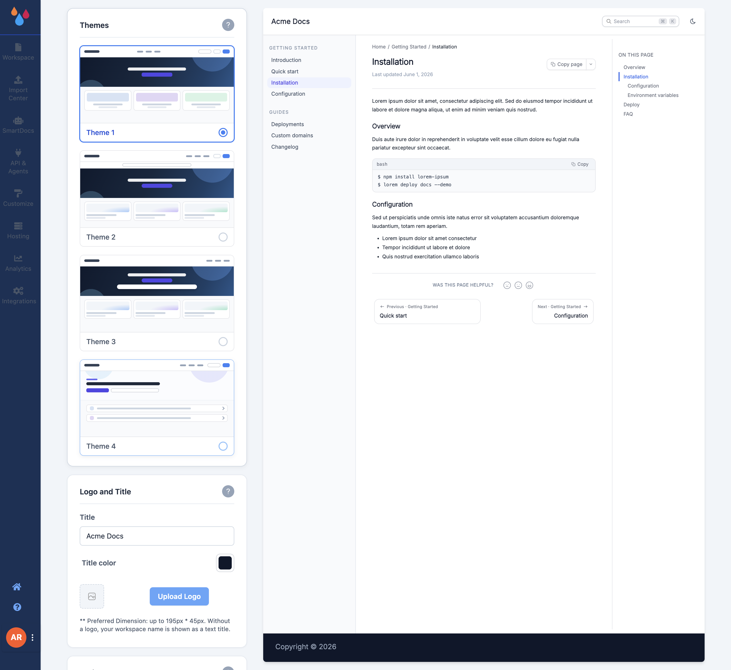
A theme sets the layout of your Dewstack docs site – how the header, landing page hero, sidebar and article page are arranged. Dewstack ships four, and the Themes section in Customize describes them exactly: "You can choose between 4 themes. Accordingly settings sections will change."
That last sentence is not filler. Which controls appear further down the Customize page depends on the theme you pick.
Pick a theme
Open Customize → Themes and click one of the four cards, labelled Theme 1 through Theme 4. Each card is a small drawn miniature of the layout; they share the same colours deliberately, so what you are comparing is the arrangement, not the palette. The choice saves immediately, and the preview pane beside the cards redraws the sample article in the new layout.
What actually differs between the themes
All four themes render the same content, the same sidebar and the same search. The differences that will change a decision:
- Table of contents heading. Theme 3 heads the rail Table of Contents with a notebook icon. Themes 1 and 2 head it On this page – Theme 1 in uppercase. Theme 4 uses its own panel.
- Page feedback. Theme 2 puts a Yes / No pair of thumb buttons in the right-hand rail. The other themes put a row of sad / neutral / happy faces below the article. See Page features.
- Reading time. Theme 4 shows an estimated "N min read" next to the page title. There is no toggle for it.
- Header CTA buttons. The two CTA fields in Header & Footer are hidden on Theme 3 – that theme's header has nowhere to put them. Every other header field still applies. See Landing page.
Themes are not numbered in layout order
The theme numbers are labels, not a sequence – Theme 3 is not "Theme 1 with more features". Switch between them and judge by what you see; nothing you have configured is lost when you switch back.
Dark mode
Every theme ships a dark mode toggle in the site header, labelled "Toggle dark mode". It is always there. There is no setting in Customize that enables, disables or forces it – dark mode belongs to the reader, not to you.
A reader's choice is stored in their browser and reused on their next visit. On a first visit Dewstack follows the operating system's light/dark preference, and applies it before the page paints, so there is no white flash on a dark-mode machine.
Fonts
Customize → Fonts has one control, Font family, and it applies to the whole docs site. The options are:
Roboto, Open Sans, Lato, Raleway, Roboto Slab, Ubuntu, Source Sans Pro, Montserrat, Oswald, Poppins, Inter, PT Sans, PT Serif, Fira Sans.
Roboto is the default. There is no separate heading font, no body/code font split, and no way to add a font of your own.
Logo, title and favicon
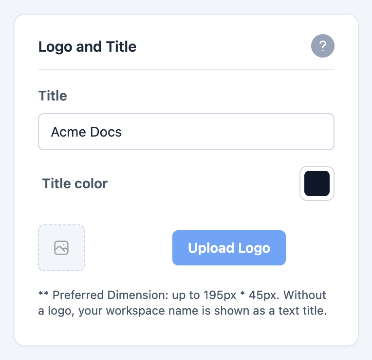
Customize → Logo and Title controls what sits at the top left of every page:
- Title – the text shown in the header.
- Title color – a colour picker for that text.
- Upload Logo – preferred dimensions are up to 195px × 45px. Without a logo, your workspace name is shown as a text title.
- Display Logo and Title both – a toggle that appears only once a logo is uploaded. Off, the header shows the logo alone; on, it shows the logo and the title text side by side.
Customize → Favicon takes one upload, at a preferred size of 16 × 16 px. That is the icon in the browser tab, bookmarks and history for your docs site.